Enhancing Your Clients' Websites with Web Safe Fonts
This is a subtitle for your new post
Title: Enhancing Your Clients' Websites with Web Safe Fonts
Introduction:
At 123Websites, we understand the significance of choosing the perfect font when building a website for your clients. A visually appealing and user-friendly experience hinges on selecting the right font. In this blog post, we will delve into the world of web safe fonts, equipping your agency with the knowledge to make informed decisions about font choices for your clients' websites.
Understanding Web Safe Fonts:
Web safe fonts refer to typefaces that are universally available across various devices, operating systems, and browsers. These fonts come pre-installed on most devices, ensuring consistent display across different platforms. By utilizing web safe fonts, you minimize the risk of design inconsistencies, ensuring that your clients' website text appears as intended for every user, regardless of their device.
Exploring Font Families:
In the realm of typography, there are five primary font families commonly used in CSS:
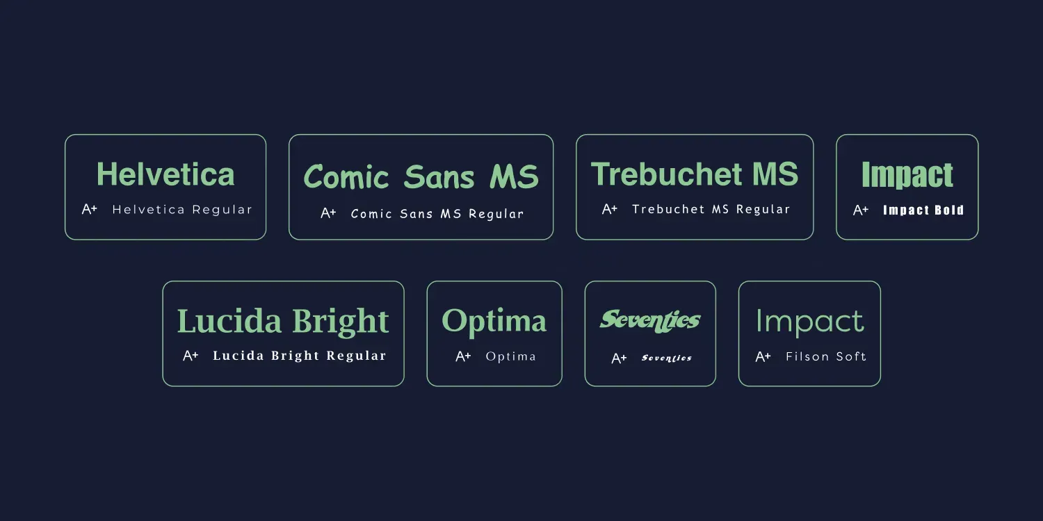
1. Serif Fonts: Serif fonts, such as Times New Roman and Georgia, feature small lines known as "serifs" at the ends of characters. They are widely used for their traditional and elegant appeal.
2. Sans-Serif Fonts: Sans-serif fonts, including Arial and Helvetica, lack serifs. They offer a clean and modern aesthetic, making them popular for web design.
3. Monospace Fonts: Monospace fonts, like Courier, have equal character widths, creating a distinctive look. They are commonly used in coding and technical contexts.
4. Cursive Fonts: Cursive fonts imitate handwriting and add a touch of elegance. They are often used in logos, web design features, and branding elements.
5. Fantasy Fonts: Fantasy fonts are artistic and unique, perfect for creating a distinct brand image. Papyrus is a well-known example of a fantasy font.
Web Safe Fonts Today:
Although some have claimed that web safe fonts are no longer relevant, this couldn't be further from the truth. Despite Google Chrome's dominance as the leading web browser, other platforms and older devices do not necessarily support the same fonts. Designing a website with a font exclusive to a specific operating system or browser can result in inconsistencies for users on other platforms.
The Benefits of Web Safe Fonts:
Opting for web safe fonts offers several advantages for your clients' websites:
1. Operating System Support and Compatibility: Different operating systems may not support the same fonts. By using web safe fonts, you ensure a consistent and uniform appearance across various platforms.
2. Improved User Experience: Using web safe fonts eliminates the need for additional font downloads, resulting in faster load times. Research shows that fast page speed influences consumers' purchasing decisions positively.
3. Web Accessibility: Web safe fonts may not guarantee full web accessibility but are accessible to all browsers. Consider factors such as readability, contrast, and scalability for users with disabilities.
Choosing the Right Font Size:
When it comes to responsive websites, it is advisable to use a font size between 16px and 20px. However, the ideal size depends on various factors. Here are some guidelines:
- Body fonts: Opt for a font size around 16px, which serves as the default font size for paragraphs and content. Adjust the size based on page interactivity or content density.
- Text inputs: Ensure text inputs are at least 16px to prevent iOS browsers from zooming in on smaller text inputs.
- Secondary text: Make secondary text two sizes smaller than the body text. This applies to photo captions, pull quotes, and footnotes.
- Headings: Increase the font size with each heading level. H1s should be at least 24px, with subsequent headings incrementing by 8 or 10.
- Fallback fonts: Always include at least one fallback font that matches the size and family of the primary font. This ensures